
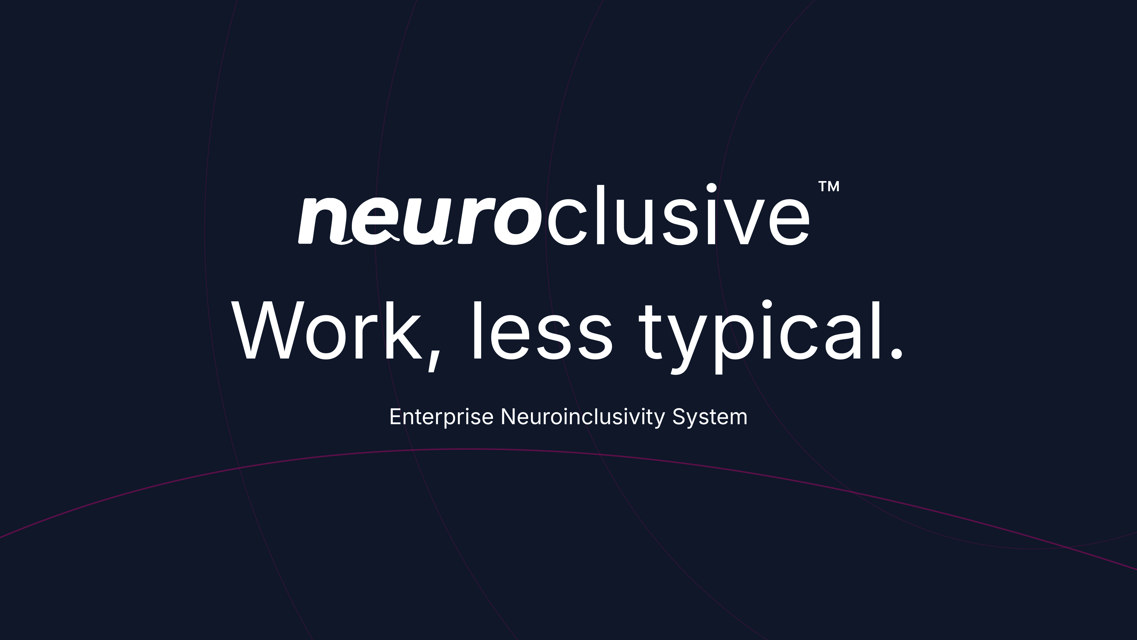
Neuroclusive wordmark / primary
4,096 px wide PNG · Transparent
The Neuroclusive brand
One brand. Everything you need to put it to work.
Official logos, crisp artwork, social banners, and the guidance to bring them together. Download a single asset or take the whole kit.
SVG + high-resolution PNG · Fonts · Six-page guide
01 / Identity
Outlined SVGs for any size. Transparent PNGs for everyday use.
4,096 px wide PNG · Transparent

4,096 px wide PNG · Transparent

4,096 px wide PNG · Transparent
2,048 px wide PNG · Transparent
2,048 px wide PNG · Transparent

2,048 px wide PNG · Transparent

4,096 px wide PNG · Transparent

4,096 px wide PNG · Transparent

4,096 px wide PNG · Transparent
Keep it intact. Preserve the proportions and leave clear space around every mark. Use white artwork on dark or filled pink backgrounds.
See the logo guidelines03 / Brand imagery
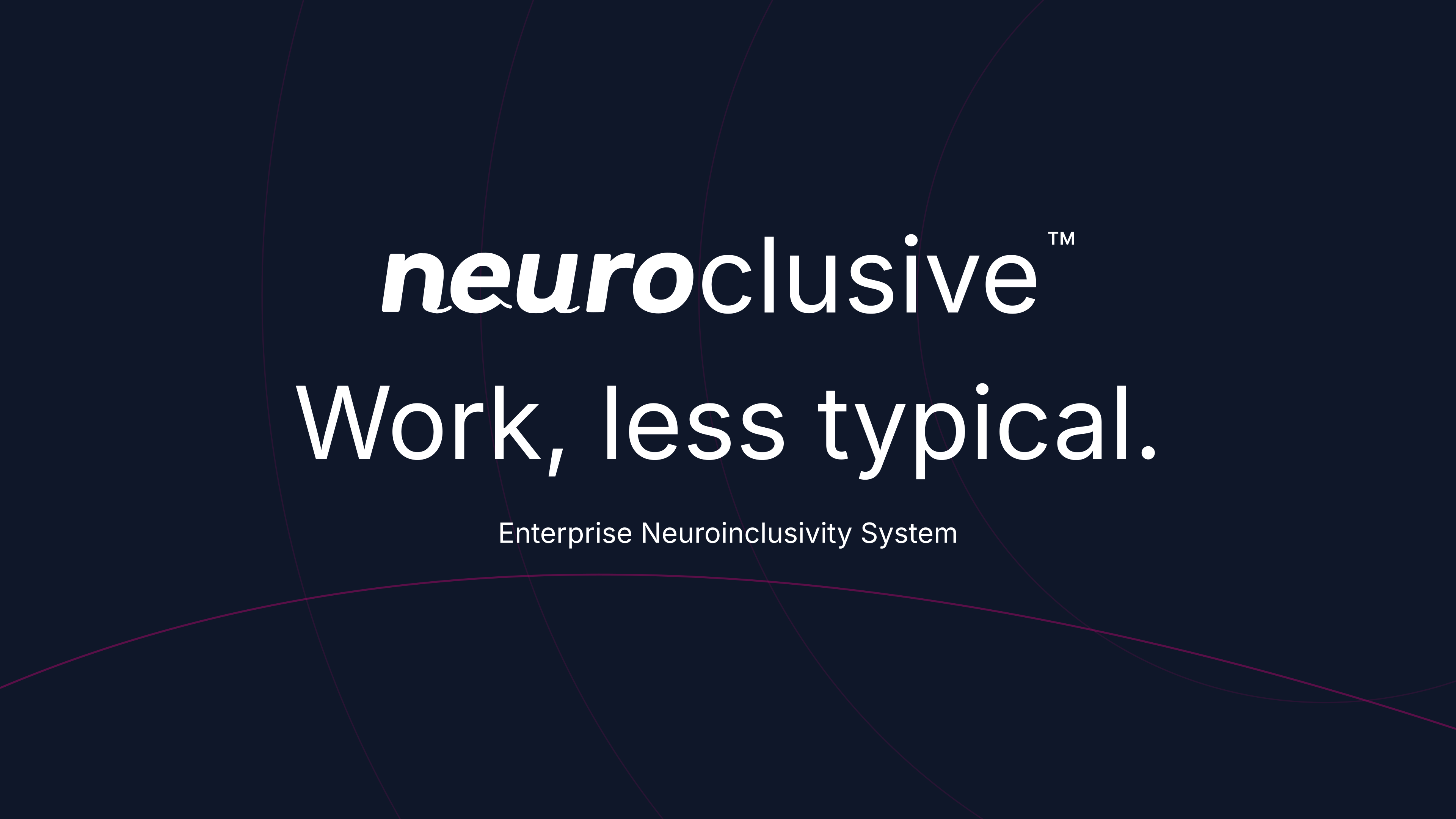
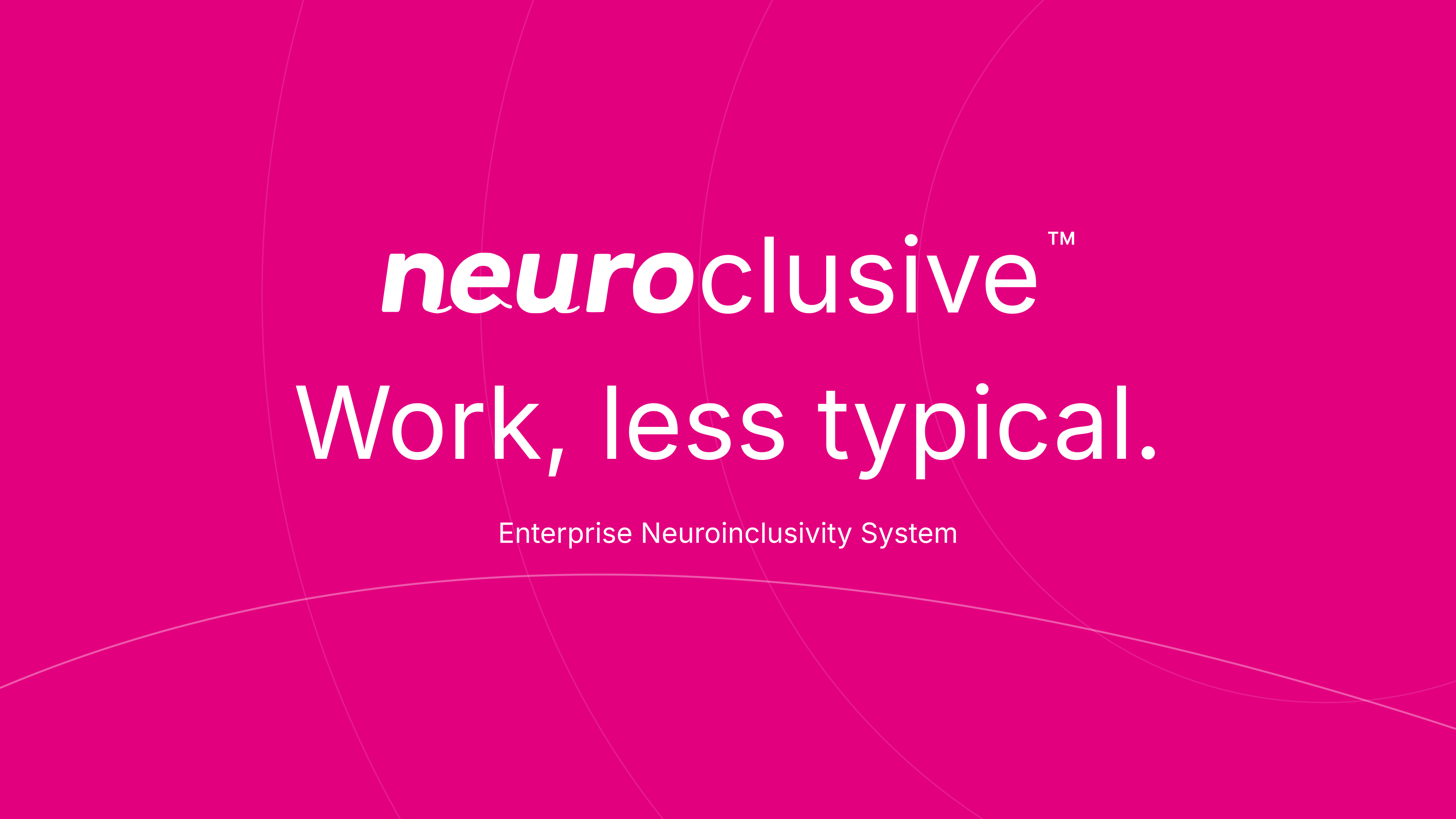
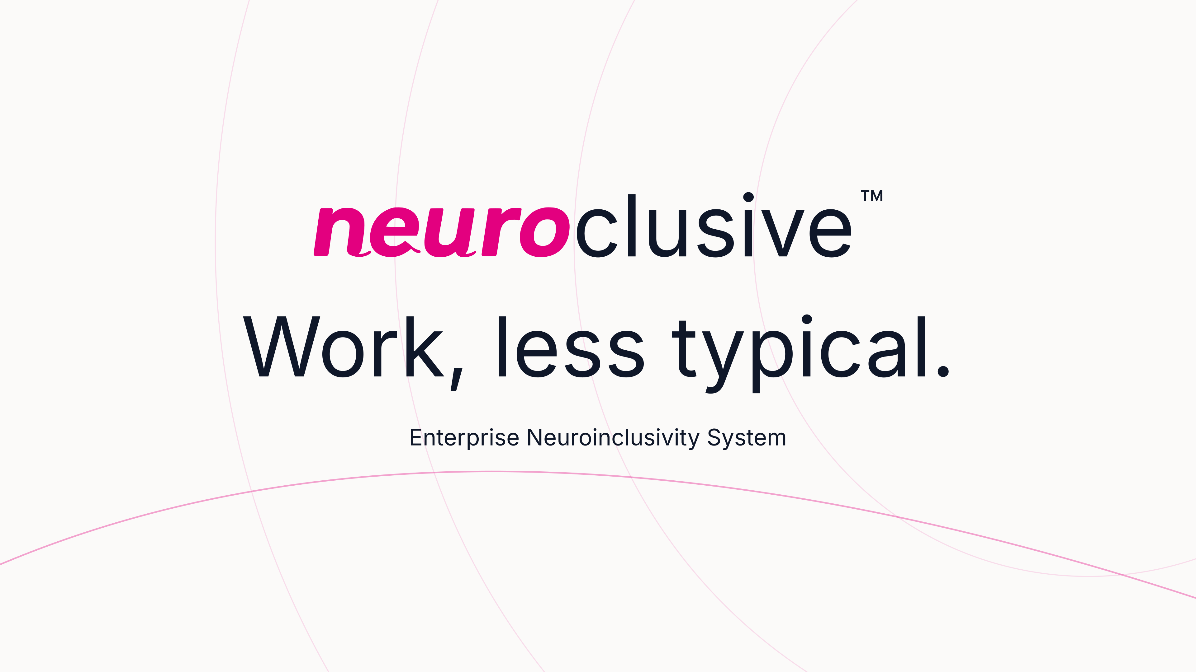
Original 4K brand graphics for presentations, screens, websites, and campaign materials.
3840 × 2160 PNG · Scalable SVG master
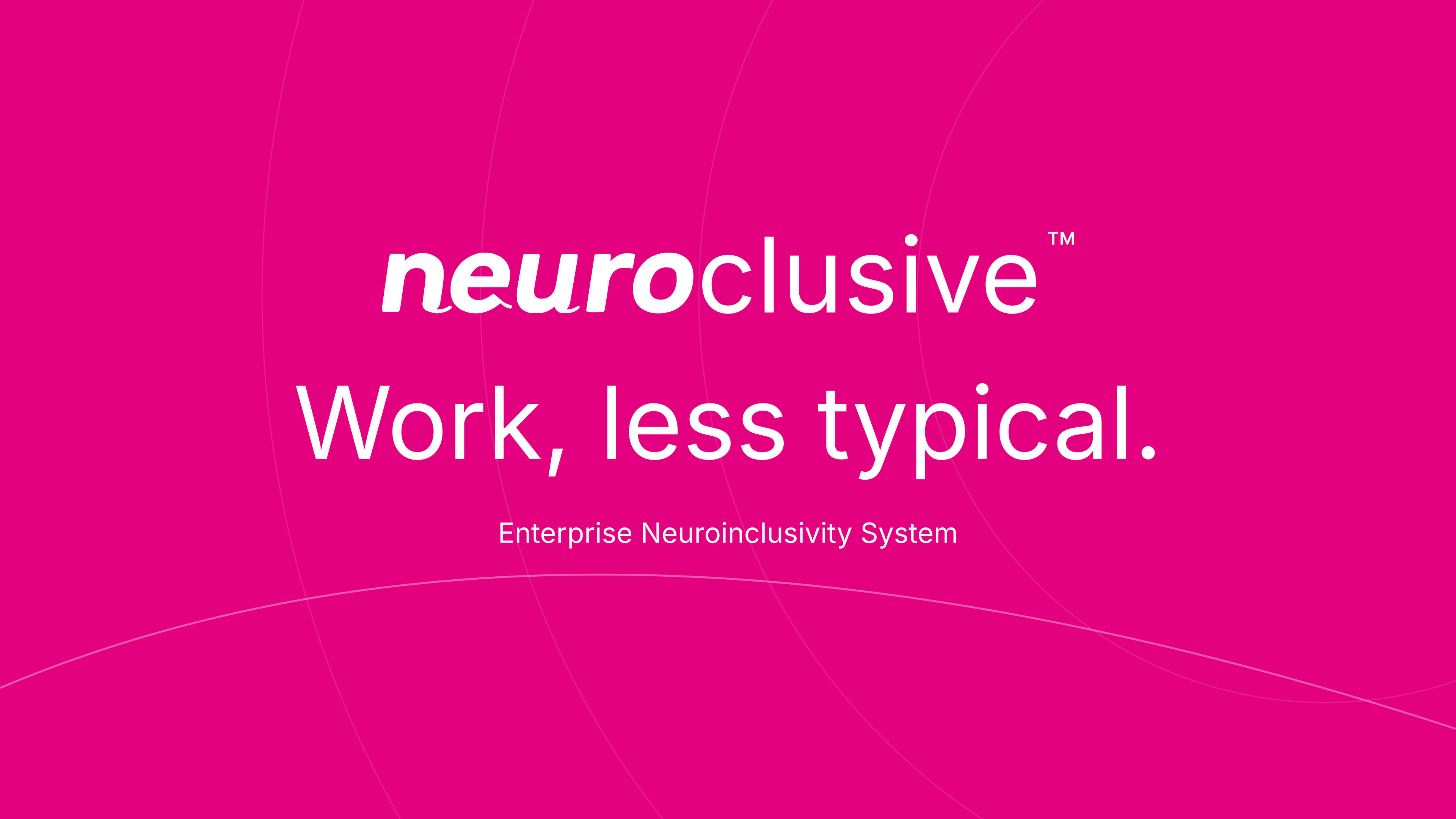
3840 × 2160 PNG · Scalable SVG master
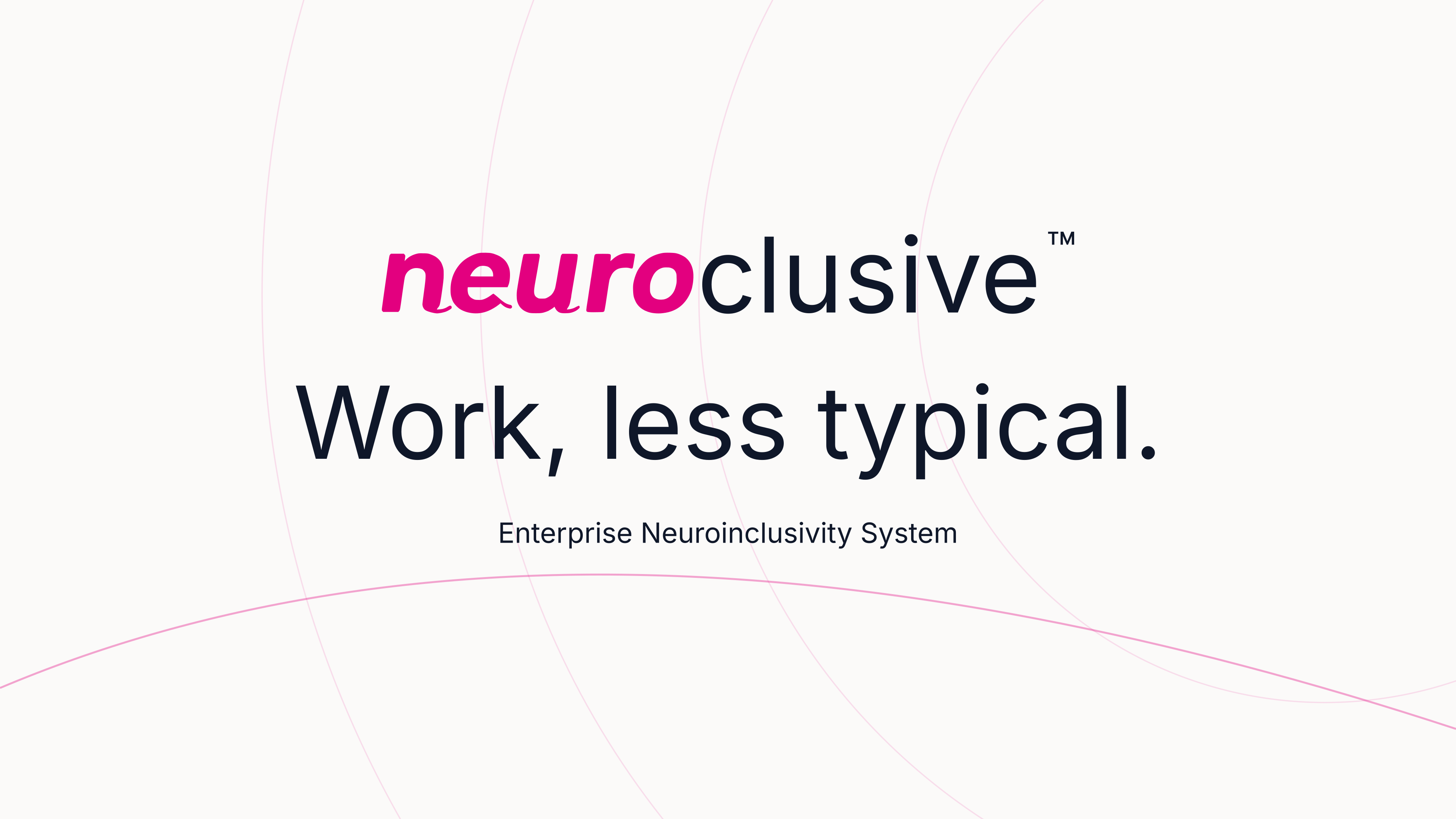
3840 × 2160 PNG · Scalable SVG master
04 / Style guide
A practical guide to making everything feel like Neuroclusive.
Signature pink. Quiet ink. Warm paper. Pure white. Company artwork uses these four colors.
Filled brand-pink surfaces always use pure white text and foreground icons. Keep product pillar and semantic colors in their own contexts.
The original artwork is the starting point, at every size.
Leave clear space of at least one quarter of the mark height on every side. Keep text, images, and page edges outside this space.
Scale proportionally. Use the supplied artwork instead of typing, stretching, rotating, outlining, or adding effects to the wordmark.
Use the pink-and-ink wordmark on light backgrounds, and the white wordmark on dark or filled pink backgrounds. Use the standalone n when space is limited.
Use a wordmark at least 160 pixels wide, or a standalone mark at least 24 pixels wide. Place it on a clear, uncluttered background.
Inter carries the message. The custom Neuroclusive font carries the identity.
Download font packClear. Human. Capable.
Inter Regular for reading. Inter Medium for headings and controls. Generous line spacing, sentence case, and room to breathe.
neuro
Neuroclusive Bold Italic is reserved for the brand prefix and standalone mark. Supplied logo SVGs have outlined lettering and need no fonts.
Inter font licenseEnterprise Neuroinclusivity System.
Work, less typical.
Use clear, direct language and concrete next steps. Explain unfamiliar terms. Keep the tone warm, capable, and respectful.
Describe NeuriPrint as employee-owned insight into how a mind works. Do not call it a medical diagnosis or an employer profile.
Write Neuroclusive, NeuriPrint, LiveLabs, Neuro Academy, Task Intelligence, and Ignitr Rooms with their established spelling and capitalization.
Use approved, evidenced statements. Keep customer identities and confidential results out of artwork unless their publication has been authorized.
Logos, banners, 4K artwork, fonts, and the style guide in one download.






02 / Social
Show up consistently.
Ready-to-upload banners in ink, pink, and paper. Choose a colorway, then download.
Facebook Page cover
1702 × 630A 2x export of the 851 x 315 cover format. Keep the center visible and check the desktop and mobile crops before saving.
YouTube channel banner
2560 × 1440The logo and wording sit inside the central 1546 x 423 area. Upload the whole image, then check the device previews.
LinkedIn company cover
1512 × 256Sized for a company Page, with essential details away from the edges and lower-right corner.
LinkedIn profile cover
1584 × 396Sized for a personal profile. The lower-left area is kept clear of essential details for the profile photo.
X header
1500 × 500Keep the essential wording centered and review the profile-photo overlap after uploading.
Square social post
1080 × 1080A versatile square canvas for Facebook, LinkedIn, and Instagram posts.
Story and vertical post
1080 × 1920A 9:16 canvas. Keep wording in the middle, away from platform controls at the top and bottom.
One avatar, every channel.
A 1080 × 1080 mark with space for a circular crop.
Upload the PNG, then review the platform's crop preview. Safe-area guides are separate design aids. They are never printed onto your banner.